|
|
|
|
|
 |
 |
|
|
Hobby projects, 2010-2014
|
|
|
|
|
|
This is a quick recap of all significant hobby projects I've been playing with over the past couple of years. Most of them are in various unfinished states, and will probably remain so. If you think a particular one is very exciting though, feel free to let me know on email or twitter and if you encourage me enough I might look into developing it a bit further and perhaps making a public version.
It's quite a stupidly long list, so I guess I'll need to chop many of the prominent items off into their own individual pages when I get a chance.
Games
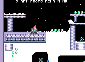
Snow
A flash game that I actually started in 2009, but didn't finish (yet). There was a small test build uploaded at one point, but no public release. It's controlled mainly with the mouse, and the character will rapidly dig his way towards the cursor while you press the button. Snow will fly off the shovel and pile up behind him. The goal is to collect all snowflakes and bring them back to the home plate without being accidentally blown up or buried and asphyxiated.
It's also possible to carry and throw bombs, or dig beneath loose structures to make them fall down. Apart from some boring enemy design, the only major parts missing are menus, sounds and a respectable set of levels. It should be feasible to create an iOS port too, which might be a better fit than flash.
Caveater
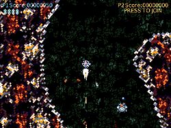
This was a very quick game making session where I wanted to make "some kind of shooter" controlled with XBox 360 gamepads, and I ended up adding a two-player mode as well. My brother created a theme song for it, inspired by something old and famous on C64 which I don't remember currently. I poked around in the song as well and it all ended up pretty nice and suitable for the gameplay.
The graphics are really weird and blocky. Just a placeholder thing more or less. Gameplay revolves around flying rapidly through abstract caves and shooting in all directions at enemies that swarm in. Some crunchy sound effects along with the aforementioned music makes it all enjoyable for a couple of minutes even though there's no actual goal.
Oh, and you're constantly chased by a large mysterious dark force that will destroy you if you slow down or get cornered.
Download here, for Windows. You may be able to play without an X360 gamepad if you run the "noxinput" version, but I don't think it will support two players that way. Keyboard controls are arrow keys and ASDW, while gamepads use the two thumbsticks to move and fire independently.
Glass puzzle
I developed this with the intention of submitting it for a recent LD competition, but for some reason I didn't. The game works though, more or less. There are a few levels that range from trivially simple to rather insane.
You move transparent smoked glass panes around to reduce the initial jumble into a single uniform rectangle. It's possible to have them overlap, and some levels require you to end up with a stack while most others will go for a single sheet.
Pieces slot into the grid with no visible seams, so it's usually impossible to properly overview a board state from a static screenshot. Instead you must grab and move a piece to see how its shape slides over the rest.
Download Win32 version here

Flighting
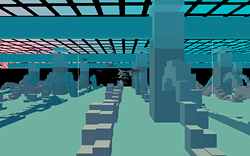
I desperately wanted to make a flying game controlled with a good old-fashioned joystick, so I did. Well, a prototype at least. I think I got the flying mechanics down pretty nicely, and it's banking and even "drifting/carving" intuitively even with just a two-axis stick input.
There was no intention for getting realistic flight. More a kind of loose arcade scheme where you feel free to make crazy elegant maneuvers without fear of crashing. I added a simple environment consisting of vertical columns reminiscent of a city, and I also recorded every test run into a ghost replay, so when you were playing there were always a lot of other ships keeping you company.
I definitely want to develop this kind of game more, although perhaps not this specific implementation. I had a more elaborate idea recently which involves combat and might be better suited for XBox controllers rather than large flight sticks which few people have.
Download Windows test version: flighting-demo.zip
Netbogus
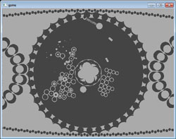
Initial premise was to make a simple test game that would support two-player cooperative network play. I started without any idea of the actual gameplay, and just added things that came to mind. It's a weird rotating playfield where you jump around with a small ball-and-chain that can grapple the outside wall. When you hang on one side it will be weighed down so the whole level rotates that way like a drum.
The center is filled with multiplying cells that grow outward, and you have to shoot them out before they reach the wall. I don't remember the exact details of these rules, or how much of them I implemented in the end, but it's pretty wild. Didn't playtest it a lot though, so no idea if it's really "fun" or not. Probably needs balancing.
As usual, two players over network was a bit spotty. Particularly as I enabled players to grab onto each other which creates a really tight feedback loop that starts glitching as soon as there is a small communications delay. Maybe it would be better to support local multiplayer on the same computer.
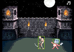
Skelets 2009
Ah, a charming idea that didn't go very far unfortunately. I once made a fun little game on the Amiga which is briefly mentioned on the old projects page. It was a single-screen affair where you walked left and right while trying to avoid all kinds of horror-themed hazards that moved in from all directions. There were bats, fireballs, walking skeletons, lightning bolts. All the usual tokens.
So I wanted to update the game for Halloween 2009, but got way overboard with graphics design and ran out of stamina somewhere along the initial animation process. I didn't have much of a problem creating still sprites looking like I wanted, but with little animation experience it got very fiddly and frustrating to make large animated images.
Probably it could have worked out if I hadn't been running on a "weekend-scale" mentality for expected project duration.
Megatroid
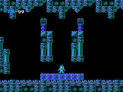
Actually this is much older than the other projects listed here, but I figured this is a painless way of sneaking it out there. I might have mentioned it somewhere since the files were already uploaded, but I don't remember and it doesn't seem to be on the main site.
Concept game made from the fun notion of mixing Mega Man and Metroid, with graphics and music ripped from both. Contains one short level with a boss that you can't kill. You'll have to do some exploration to find it.
Download for Windows: megatroid.zip
Swapper puzzle
Not to be confused with the recent popular game "Swapper".
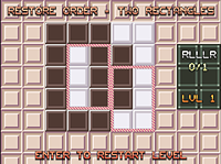
This is another little grid puzzle for flash. Once again it basically works fine and even has some 15+ levels I think. Not sure why I haven't uploaded it for people to play. The idea is to make a rectangular selection around some tiles, then pick another location for swapping with that area. In as few moves as possible, you need to reach a state where the board consists of just two rectangular zones - a white and a dark one.
Actually I remember it has been uploaded for years now, but I only told a handful of people.
You can play it here. This version seems to have 17 levels. Cheat/skip button is space.
Usually it's possible to just mess around at random and eventually stumble upon a solution, but that also makes it likely you will create an even bigger mess and make it harder to see a way out. One drawback is that it's often very hard to see what impact your next move will have, so you can be surprised by suddenly completing a level without realizing you would. With two steps or more until it's finished, you practically need to experiment a lot before you understand how it goes from start to finish in the minimum number of moves.
So it's probably fun for hardcore puzzle freaks, especially if you create levels for other people (it's one of those games where making a level is super easy, but solving it is hard). Casual players will have a hard time really enjoying it though.
LD18, Kanbran
A single-screen platformer made in 48 hours and submitted for Ludum Dare 18. The theme was "enemies as weapons", and here you will jump on flying enemy robots forcing them into the ground to make turrets that might shoot down remaining foes. While standing on an enemy you can control them loosely to turn left/right or dive.
I'm happy with the concept and the game also plays reasonably well although the difficulty curve is very sharp. The first few levels are easy, then it gets almost impossible on level 4/5 when there are shots going across everywhere. Basically if you let the enemies get a little bit out of hand they will overrun you quickly.
Download here, for Windows
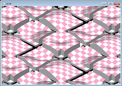
LD19
Theme: Build the level you play.
I started making an isometric map rendering system, and the idea was probably that you'd raise/lower the floor to make a ball roll where you wanted.
Didn't spend many hours with it, and there was never any working gameplay.
LD20
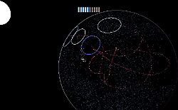
Theme: It’s dangerous to go alone! Take this!
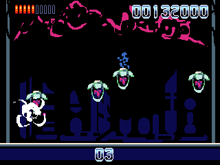
The theme was interpreted as a short background story where you're told to bring a special kind of crystals on your spaceship/plane to enable flying through a dangerous spherical volume to collect valuable material. I don't actually remember all of the original explanation/idea, but it's pretty cool in a way.
You kind of dive through the sphere in short paths to avoid running out of "shield", which is rapidly depleted when you go into empty regions. The special stuff you brought with you is trailed out behind marking these areas. So basically avoid the pink trails and fly through the blue dot clouds. The blue dots keep your engines running safely, I guess.
It probably requires some trial and error before you understand how to play. I think there are four levels in total.
Here's a prototype video, and here's the Windows download
LD21
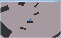
Theme: Escape
You jump around with a squishy character on platforms, changing gravity to match the surface you most recently landed on. As a result, you can navigate rather unexpected sequences of corners and walls, if you don't get completely disoriented and nauseous first.
The goal is simply to escape the level you start in.
Download here, for Windows
LD22, Turbo Singulation 6000
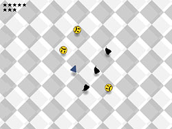
Theme: Alone
Very basic flash game. Click and drag to hit all objects except the single unique one. Requires fast identification skills. It's sometimes easy and sometimes hard, depending on the images selected at random.
Play it here
LD23
Theme: Tiny World
For this one I only managed to produce a concept and a very basic principle test in code.
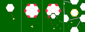
The game was supposed to take place inside a hexagon, which splits open when you shoot it. Each subdivided level would reveal a different set of weapons and defense systems, so you'd soon end up inside a crazy hostile maze working your way into the core.
I don't remember if I wanted it to constantly zoom in, or if it would happen in steps as you progressively destroyed features of the enemy.
Could have been cool, and may be worth revisiting at some point.
Paintfish
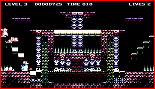
A platformer inspired by "paint the floor" type games, specifically an AMOS demo game called "Dithell's Wonderland" where you would basically run around on glass tiles to color them in, while avoiding enemies.
I started making this as an attempt at quickly building a working prototype game without any distracting graphics besides placeholder rectangles. It worked out well and I had something playable within a day or two. After that I used the integrated level editor to make about 20 levels before I decided that it would be worth making some graphics after all.
I drew some simple brick tiles, and came up with a pretty charming player character that is also squishily animated. It all seemed to move along really great, but with time I kept adding more tiny ideas left and right, which also inflated my ambitions for what the game would turn out to be.
Probably it started to get "too good" for its own premise, sort of. I didn't want it to be a throw-away test game anymore, which made the project more scary and I pretty much took my hands off it.
There are some question marks regarding enemy behavior, and how levels might be tied together in a broader sense than just a dumb sequence. Apart from that I could just create a hundred levels, a title menu, make some music and sound effects, and it would be done.
The game kind of deserves it actually.
Rototoro
Almost the same story as above! Started with simple ambitions. Just a side-scrolling "beep boop" game like early 80's NES titles. I was designing it with my brother, brainstorming ideas and drawing some graphics.
It was a lot of fun, and I had a basic prototype running on my iPad after a few days. We then decided to go for a full-blown "game making week" where we locked ourselves up in my apartment and went crazy with paper design, graphics, audio and a huge flow of ideas.
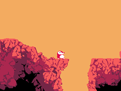
The concept blew way out of its early proportions, and now it was suddenly an epic 6-level platformer adventure, with many one-off special enemies and events. We completed a "rough cut" of the first level which has an initial flying sequence followed by traditional run-and-jump and a boss.
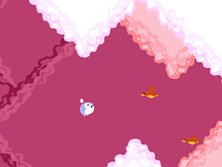
Basic setup is that you control either one of two small characters who have a symbiotic relationship where they can help each other through various challenges. Roto can jump and shoot blueberries, Toro can fly and carry Roto in his stomach.
Again, increasing standards and expectations meant early graphics weren't "good enough" anymore, and the rocky environment I had scribbled for the test level didn't feel right. So we were trapped in a loop of wanting to redo and improve everything before we could proceed, and probably repeat that process again further down the line... We ran out of focused time to spend on the project anyway, so it wasn't realistically possible to continue.
Maybe. Future.
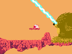
Curvetrack
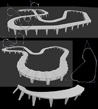
Another attempt at car simulation! Who would have known... Actually it's part simulation and part track creation. I wanted to make a convenient editor for building racetracks without lots of manual mesh manipulation, and also so you could test drive them and then easily change the layout instantly based on feedback.
The solution was to model template segments of road that would get repeated and stitched into a smooth flow along a curve drawn in the editor. The curve was actually made from corner control points which each had a radius parameter. That way you could easily make arbitrarily sharp or soft bends that were always of circular profile. If you wanted one that tightens you'd have to string two after each other.
It also had parameters for elevation and banking. Surrounding environment would need to be added later using some unrelated method, since it would just be a visual backdrop that you never drove on. Probably a form of textured heightmap would be ok there, and/or hand-built set pieces.
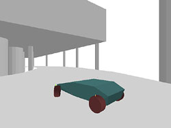
The simulation was a slight evolution of my previous rigid body code. This time with a wider range of realistic properties before I started to fudge things up by the seat of my pants. I wanted it to all be physical and sensible, but certain aspects are still hard to properly grasp and I couldn't quite do it. Still, technically better than last time around although not as carefully tuned so it didn't feel very much like a real car.
Mountaineer
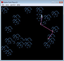
Ok, this one is pretty stupid. I had a funny idea about a climbing game that might be like those really old Atari 2600 games. Abstract graphics, a handful of objects, and a story defined by the cover art basically.
You climb up a rock face, choosing to place or retrieve anchor spikes as you go. There's a safety line running between you and the spikes. The challenge comes from random chance wanting to throw you off at any time, and if you haven't anchored sufficiently close by you will fall to your demise. There's a limited number of anchors available at one time, and I think the wall had different surfaces that were more or less prone to slipping.
Anyway, a fun exercise in minimalistic game design perhaps, although I didn't really intend for it to be classically "enjoyable".
Balloons
Another small test that is hardly worth mentioning, but I do it anyway since I want to finish a game like this some day...
Basically I challenged myself to create a Balloon Fight-like movement mechanic within one hour of coding, and it worked out rather well. You can fly around with your two balloons, pop enemy balloons or get your own popped. Not much more to it, right?
Some graphics would be nice, and some level design. I should look into it again if I can make attractive concept art.
CheeseHammer
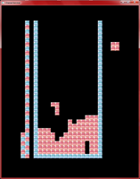
This is a custom programming language that I will almost definitely need to write a specific page about. It compiles into a kind of symbol list that is executed by an interpreter/VM, but the design evolved quite a bit during development so there's no neat bytecode format defined.
I wanted something for quick prototyping with familiar syntax but less clutter and housekeeping than you'd get in C++. Also I wanted the basic I/O stuff to be handled behind the scenes so I could always just fire it up and start writing applications from a few lines.
Still a work in process, but I've already made good use for it with many small tests. It currently runs on Windows, iOS and Ouya, with slightly varying degrees of media functionality. Basically it has a nice 3D+shader system on Windows but not on the other platforms yet. I've used it to quickly test out ideas that I was put off from trying in C++ due to the fiddly setup of shaders and test geometry.
It could possibly be neat as a beginner's tool if distributed with a custom highlighting code editor and runtime environment. It's very friendly and accessible if you try to write "obvious" flat game logic without complex structures and algorithms.
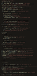
For the tetris source shown below, I tried to make it super-compact rather than "simple". That's partly why it looks arcane and certainly not beginner-friendly. I'll create a more appropriate example game at some point which should be much easier to understand.
I will note in other projects on the page if they made use of this language.
Carry
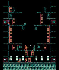
CheeseHammer game made as a loose derivation of the Wrecking Crew formula, and initially using its graphics as placeholders.
The gameplay has almost nothing in common with that game, as here you're actually trying to water pots in order to grow flowers that girls will buy from you.
There's no jump button, so you must climb ladders to reach higher floors. You can pick up and carry objects or throw them. Girls will pay increasingly high prices for flowers until you fail to deliver one in time before she leaves. It's not clear if they're all the same girl or not. Might be.
It's pretty hectic, and aimed at two or more simultaneous players cooperating. One can go up to grab new pots that fall down from the sky, while the other waters them and moves finished flowers out to service the customer. On some levels you need to have two watering stations since the girls can come in from many different places.
Not quite done yet. Could use some more surprise features and challenges to keep it interesting. Also more environments and levels, and fully original graphics and audio.
Varsystem1
Another idea for quick prototyping aids, but this time focused on live variable tweaking. I wanted to tag variables in my code with minimal intrusion to then get GUI elements rendered when running the application, where I could change the preset values and directly observe the results.
This is a need I have particularly noticed while doing all my car simulation experiments, where it can often be difficult to correlate all your little tuning between different runs, when there's a pause of several seconds before you have it compiled and driven to a comparable arrangement again after you tried changing something.
You could also want different controls for adjusting different types of values, like a standard slider, a 2D X/Y gadget, a number input, a color picker, etc. And some things might benefit from being plotted and graphed in realtime. Definitely I'd love to have a correlated X/Y plot of value pairs when adjusting stuff like grip curves or suspension behavior.
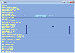
Anyway, this particular implementation works but didn't get used for anything but a simple test game where I could manipulate all aspects of Pong into oblivion... The idea was also that if I put ALL of the relevant game data into these controlled structures, I could save and restore snapshots easily.
It's a decent general concept, and I could probably implement it a lot more neatly in CheeseHammer where I have access under the hood and I wouldn't need to explicitly instrument my variables with ugly tracking syntax. The neatest solution would be to have code editor windows in the actual running application, and click to examine any variable directly. Maybe even modifying code on the fly, but that starts getting somewhat unstable in the general case even if it could certainly be done for static values.
Asteroid game
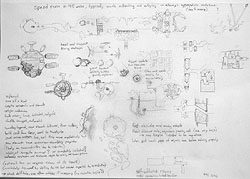
Not "Asteroids" at all, but rather an ambitious space flight/exploration game which for once I designed pretty well before starting. Actually I must admit that most of the work has gone into design so far, as I didn't really get a flow going on the code side and left it stranded after a month of sporadic activity.
To make it work, I'd need to develop a nice hierarchical editor for moving scripted structures of machinery/environments that would make up the game areas. You're supposed to dart around elaborate traps and hazard with your ship that has some special abilities like dash-and-bounce or other things collected along the way.
You could also get access to cool alternative vehicles for subterranean travel and the like. Overall it should be a mostly wordless adventure uncovered piece by piece as you work your way through a dark derelict asteroid space station.
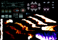
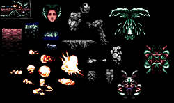
The graphics are pixel-themed, with an interesting "supersampled" low-palette system I implemented in a shader which allows cool special effects and organic animations without breaking the color limitations and starting to look "fluffy" or "filtered". It would support multi-colored shaded objects with local parts rendered in specific palette ranges.
Here's a snapshot of the original pencil design page, and some test graphics which are part drawn and part realtime generated (the fire). I was struggling a bit with getting interesting mechanical structures down, which I don't have a lot of experience with yet.
Graphics
Cliffy
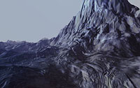
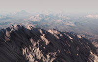
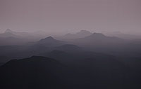
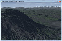
As mentioned above, I wanted to make a flying game. Flying isn't much fun without an environment though, so would be nice to have a nice system for generating and rendering natural landscapes. Old folks may remember a time back when heightmap terrains were the de facto test project for any budding 3D graphics programmer. Not sure if that is completely out of vogue by now, but I sure don't see it around as much. Probably just as well.
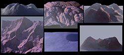
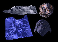
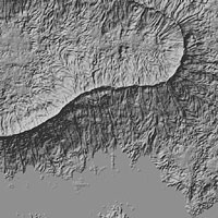
This one started out with a very intense few-day session of trying out various ideas for generating heightmaps using all kinds of noise and erosion algorithms. It was surprisingly effective and started looking really nice even with basic software rendering as an orthographic "column surface".
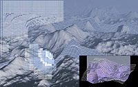
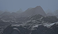
From there I went on to hardware-rendered OpenGL surfaces, with a quadtree-like dynamically subdivided grid to allow polygon density varied by distance and angle on screen. Fortunately I was still working on my old laptop at this time, so I had to make an effort to reduce polycount if I wanted interactive framerates. Later I moved on to a desktop machine several years down the hardware evolutionary path, and rendering optimization suddenly seemed like a big waste of time. I haven't adjusted parameters to evaluate a reasonable configuration on modern computers. These screenshots are all from the old 2009-era laptop and typically ran at 30 fps.
At that point I had stopped developing it anyway, because I had run into a big annoying problem with how to generate interesting surface shapes. The routines I had experimented with early on wouldn't directly translate over to the OpenGL version since I needed to build small patches of varying resolution, and my algorithms used cellular simulations locked to a fixed grid size. I needed something that could be evaluated directly for any arbitrary point without a huge penalty.
The most promising variation that I found was to overlay multiple transformed copies of a map (or several different maps) at scales getting progressively smaller and eventually making a nice fractal pattern. They reused the previously larger result when subdividing, so there was always a reasonably small fixed amount of work done to get a new set of four smaller tiles.
At one point I was going to use fully omnidirectional vector displacement maps to create any wild surfaces without traditional limitations of heightmaps, but going down that path added a lot of extra computation for building the vertex buffers, so I'd either skip it or try to implement part of it in a vertex shader as CPU relief.
Unfortunately it still wasn't obvious how to generate a useful set of maps to overlay and mix, and at this point my ambitions were running away from my abilities and I was frustrated at not being able to generate a very basic chipped rock surface. Essentially I wanted something that looks almost exactly like a traditional linearly-interpolated perlin noise map, but without the rectangular grid artifacts which really stand out in 3D.
Will probably be able to recover a lot of work from this once I find a specific need, like indeed a flying game, or maybe an idea I had for racing along a huge procedural landscape.
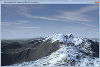 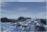
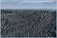
Fluidtest
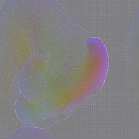
Fluids. One of those topics that keep nagging me. I can't seem to find a good formula for getting nice swirly flow going, and when I try I'm torn between trying to make it "dull and plausible" or "pretty but broken". Also I don't want to read about how most other people do it... as usual.
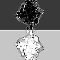
This one got most interesting results from being completely glitchy and inaccurate. In one case what looked like a speeding bullet spawned after running for a few seconds, then it passed the whole simulation field and smacked into a stationary chaotic mass before the whole thing just swirled around into gradually settling smoke. Another looked like a string of incendiary explosions set off "Apocalypse Now" style.
I eventually got it more tied down into an energy-conserving formula but then it was all completely boring to watch and I still couldn't get any kind of turbulent behavior out.
There was also an idea I had about variable timestepping so I could theoretically have small parts of the flow going much faster than everything else and still iterate properly without losing any significant information. It would also speed up the overall simulation rate since large areas of nearly zero motion would just tick some timers waiting for an opportunity to step.
Clusters
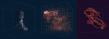
More fluids, or rather clustering swarms of small objects. Mainly the idea here was to implement a dynamic octree grid that would track a point cloud and enable me to quickly perform spatial operations like attraction and directional smoothing.
Not exactly sure how effective it turned out to be. I think in most cases it was faster to simply divide the volume into fixed-size boxes. I ended up making a neat fish simulation which if squinting looked reasonably like what you might see on underwater documentaries (except with cheap line rendering, colored based on "body angle" towards camera), and another one with abstract clumpy masses flowing around and making strands.
Rastrodon
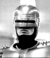
Just a very simple tool made for my brother to convert images into raster-dot fields. Not sure if it ever got used for anything, but it was a fun diversion for a few hours. Not entirely gamma-calibrated, but pretty effective.
Defish
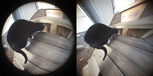
I had a phase where I kept buying weird lenses for my Micro 4/3 camera, which has adapters for almost any format. One of them was a really terrible fisheye with blurry focus and massive chromatic aberration, but the field of view was entertaining, and I wanted to see what it'd look like without the perspective distortion.
Took me surprisingly long to realize that the inverse transform would actually be omnidirectional from center (I think somebody had to hint at it), but it turned out to be a pretty simple operation. Before that I got a formula that was based on crossing ellipses and yielded perfect results only for images where the primary subject was made of orthogonal shapes aligned with the camera axis, so basically looking straight into a room. That probably threw me off.
Enjoy a funky cat picture!
Starblend
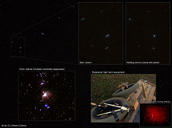
This project was mentioned on twitter at one point. Another branch of my camera interest was to attempt astrophotography with various technical aids to improve the typically unimpressive optical properties of my equipment.
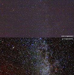
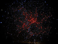
A first step was to trigger a long sequence of relatively short exposures with wide enough angle that my main subject remained in view on all pictures. Then I wrote software to track prominent stars in those shots and realign them all to match before averaging the pixels together to reduce noise. I also shot a large number of black exposures with lens cap on immediately following the session so I could subtract a relevant static noise reference.
This worked out really well for wide angle shots, but with large tele lenses I ran into the problem of objects rotating along the sky fast enough to streak across the sensor even for very short exposures. I couldn't go lower as the noise ratio would swamp most of the usable color data.
I really wanted to use my fancy 85mm f/1.2 lens, so what I ended up doing was to build a mechanical rig that enabled my camera to rotate very slowly around the same axis as the planet, but in reverse. Result being of course that its view of the distant stars remained fixed, within some degree of tolerance.
Even though I operated it by hand-cranking a set of wheels and spools with copper wire, it was accurate enough to enable exposure times of around 10 seconds without significant blur, which was plenty enough for the software blending to stack them later.
An obvious and welcome improvement would be to get something automatically operated, probably through a microcontroller-directed stepper motor, which would be able to run the camera with greater precision and for much longer periods of time without succumbing to boredom or digital freezing... No matter how enthusiastic you are starting out, you're bound to lose interest after sitting stationary for an hour out in the middle of winter with no gloves on.
Naturally, there are devices to buy for this very purpose, but I don't have to tell you that that would be boring, do I?
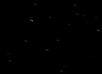
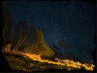
As for the images below, one is showing an example of noise reduction looking at a wide view of the milky way, which is kind of unimpressive really since even a perfect signal quality would still have lots of "noise" in the form of countless stars everywhere. There are two pictures illustrating the star-tracking algorithm, and one showing what happens when it starts tracking and morphing irrelevant parts of an image that aren't actually stars...
Linedrawing
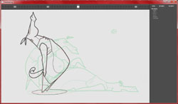
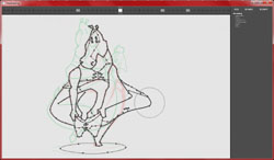
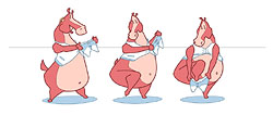
At a whim, I wanted to make a hand-animated cartoon clip. As you do. I started by making a small set of pencil sketches for keyframes I wanted to include, and then figured I'd "just make an application where I could create intermediate drawings" and that would be it.
Well, I did, and it took me over a month in all, but it worked. Turns out the idea I had for tweening through partial morphs to reuse prvious lines wasn't all magic bullets though. I needed some way of layering different overlapping objects, but didn't have that option implemented so I worked around it by manually adjusting endpoints all over the place. Would probably have saved a lot of time by going into the code and adding that functionality.
Also I wanted color, but couldn't quite decide on a reasonable way of filling concave polygons that would work reliably, so I opted for bitmap-based flood filling with preset source points instead. Worked pretty well for a hack.
The main thing I did right was the way I solved curve controls. Instead of traditional bezier tangents I used soft "attractor points" that you could tweak to make the line pinch in towards them with varying strength. This could get you from soft circles all the way to hard corners, with a pretty easily understood interface. It seemed natural from some drawing I had done on paper previously.
You can view the finished animation here (XviD/DX50, 2 MB) if you're interested.
I lost most of my ambitions for a neat result about halfway through due to various issues with the application, so it turned out pretty wobbly and cheaty in some areas where I could have added more polish if I were really patient.
Boxtown
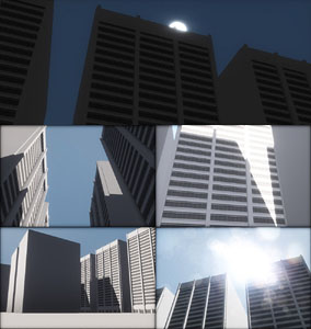
This is a CheeseHammer project where I wanted to play around with some shader techniques that I never got around to trying in my usual C++ environment.
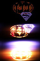
Primarily I wrote a screenspace blur filter which combined with non-linear floating point color mapping to make neat photographic-like images from HDR input. Basically you could put a normal picture in and it would look more or less the same, or you could punch some pixels up to many times the "white" intensity and they would bloom out as if dispersed by imperfect optics. Also the non-linear mapping in itself allows great white-clip protection by rolling off smoothly into horizontal. That removes one big "artificial cue" and allows much more movie-like color reproduction.
To do this with my language, I used some built-in functions for drawing screenspace quads mapped with given image files, and embedded shader code directly in the main source file to avoid a clutter of different editor windows. For small examples where the shader is of comparable importance and scope as the application code, this works out great. There's no bizarre association between shader uniforms and code variables. You actually get a struct where you can set them directly.
Later, I tried moving on to a 3D scene where you could walk around among some simple buildings, and look at a sunny sky where everything was tuned to reasonable HDR values so the colormapping filter could do its thing. It all has a variable exposure gain value that the user can tune up and down while playing.
Oh, and towards the end it got shadows and a dirty lens which I suppose is required these days.
Boxels
Some years back my friend X-0ut was working on a voxel game (I think he still is!!), and that got me thinking about ways of creating smooth low-resolution character animation in such a system.
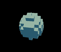
What I came up with is to add "antialiasing" by stretching the individual boxes so that they slide in and out of their neighbors, depending on their desired "intensity".
As a proof of concept, I made a sphere swoop around in a window, and it actually looked pretty neat. One limitation in that test was that I only stretched them along one axis, since otherwise it would start getting a bit tricky to define quite how the deformation should take place. I think I tested it with two axes and it was more or less ok.
Could be that you'd require something more elaborate than "intensity" for the partial voxels, and instead using a kind of evaluation of the underlying solid form to be rendered, but it does have the potential of showing fluid sub-voxel animation without breaking the illusion completely by going to polygon meshes or weirdly rotating blocks of cubes.
Fractalswim
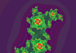
Another older project that I don't think was shared anywhere. A really simple Julia set fractal renderer that has some extra quirks by dynamically subdividing tiles to render the image live in OpenGL and gradually adding detail. You can "swim around" in it with an XBox 360 controller, enabling analog movement, rotation and zoom. Well, you can't since I haven't uploaded it, but do take my word for it.
Bitplane image compression
Data compression is always an interesting challenge and a fun exercise. Especially since it can be done with so many different techniques and principles. No matter what approach you use, the typical outcome is similar. At first the compression gains are dramatic for every obvious feature you add (well, after initial bugs are eliminated), then it gets increasingly hard to squeeze more bits out as you approach the "inherent information content" in the dataset which cannot be removed.
This creates an addictive and highly encouraging environment to start out, which progressively grinds down into tedium when you're too far down the dimishing returns end. Thus you get a limited time of fun experimentation and then a natural exit point. Perfect for me ;)
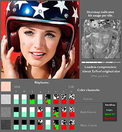
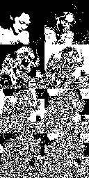
With this thing, my initial starting point was to try and leverage the idea that typical image color channels can be split into eight bitplanes, each being a black-and-white mask. The patterns in each plane tend to go from coarse to fine as you move down in the binary number. I wanted to try encoding these planes individually such that many bits would be saved for the upper planes where you saw mostly flat areas.
It probably turns out practically very similar to ADPCM methods that explicitly code differences between neighboring pixels and save bits when those gradients are small enough to fit within a limited number range.
I had it running on 8x8 pixel tiles, and added some extra tweaks like adaptive pre-filtering to reduce the energy of strong horizontal and vertical edges.
Typically the compression ratio ended up at about 40-60% (of original data size, so smaller is better) for lossless encoding of natural photographic images. Large empty areas like sky tended to drop the output size, obviously. For all photos it did significantly better than PNG, which isn't particularly surprising since PNG normally doesn't use a lot of domain-specific content awareness. It's more like a zipped version of the raw pixel data, and works best for synthetic graphics where my algorithm instead is hopelessly inefficient.
I also added a lossy mode, which traded a varying number of least significant bits for deterministic whitenoise. The noise was known at compression time and biased to make average-correct signals, so it should end up being a fair dither without banding. It selected the number of planes to drop based on local contrast within the tile. Thus noisy or densely detailed areas got heavier compression since you're less likely to notice additional random distortion there.
The lossy mode usually ends up around 20-30% of the original size, and actually it was better the noisier your source data was, since it didn't smudge or warp anything like excessively harsh JPEG does. You can't tell if the noise comes from your original image or from the compression. Although of course, it didn't get any better ratios than high quality JPEGs either, so it's not really an improvement other than the fact that I could make the format support alpha channels or other meta-data that JPEG lacks.
In the end it's just a fun experiment and a mental puzzle to play around with. I also got to practice some valuable bit juggling skills to conserve and restore data while building a dense bitstream.
Adaptive blur/enhance
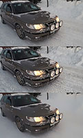
Image filter. The core notion is a contrast-aware blur that expands from a pixel to factor in neighbors until it diverges too far from the original color. I think it actually does it in two separated 1D passes, but can't swear on that.
This allows for some pretty cool detail reduction to make simplified images that still retain their main shapes. In a sense "cartoon illustrations" or paintings. It could definitely be used for automated painting algorithms, which is something I'd love to experiment more with.
Another secondary use is to take the simplified image and add back the difference between it and the original, to instead boost those details which were at first removed. This works better than your typical "unsharp mask" filter which just takes a dumb blurred version of the image and does the same. With a smart blur, you don't get any distracting edge halos. You can also do it in separately controlled passes with different blur strength to boost various detail scales more carefully.
Ít turns out to work pretty well for video images too, with insignificant flickering. I used it to make a toon-shaded clip from one of the Bond movies, which was fun. The visual style of the scenes I chose were already pretty stylized, so the end result worked to enhance that look.
More typically in movies you'd see detail boost according to the other principle I mentioned. I actually used this integrated with the video editor listed somewhere below to easily enable such effects.
Twat
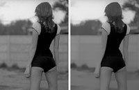
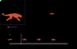
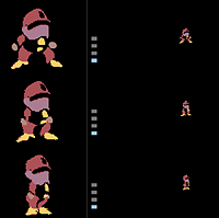
Idea: Fluid pixel animation by using a guided morph between sets of keyframes, designed on 4x supersampled images and rendered back at the lower target resolution for ample subpixel activity.
Result: Works fine for some cases, but I used a very flawed "reverse lookup" distortion model which doesn't really work at all for this. I should have made it forward-displacement of the image grid, possibly using texture-mapped polygons.
It also requires separated layers if you want to animate anything that will pass over something else, which I implemented without any major issues.
Could probably use the principle at some point in practice, maybe combined with other ideas to make the content more or less dynamic/scripted rather than hand-drawn.
Art
ttcanvas/Canvarion
I started working on a simple digital paint app with the intention of making something where Taron and I could paint together over the internet.
That ended up working, but we soon got carried away into adding more and more brushes and tools instead of actually painting, and eventually he branched it off into a separate version which was relabeled Canvarion. I'm not sure if there's any more info available about that online though. He's more recently working on a completely different application with simulated fluid paint which is wild.
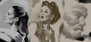
I made a couple of test paintings with this thing at least, and I remember it had a nice natural flow for me when I used a round brush coupled with a blur tool to create and adjust shaded gradients. It tended to make the image relatively soft and simplistic, but at least it was very controllable.
These images were all done from reference as practice.
Bristler
Since ttcanvas ended up producing soft mushy images, I wanted to try a completely different approach that would allow more interesting grungy patterns in the brushwork. I started coding a directed "strip"-based brush which would take a varying noise pattern and drag it along the cursor path.
The benefit of this is that it's very easy to get different bristle-like structures, with the drawback that you can't easily handle the situation where you suddenly change direction or muck about in an area on the same scale as the brush diameter. You will tend to have the strip rotate all over the place.
I solved that to some degree in that it at least won't cut and make weird artificial marks, but the core issue remains and can be distracting sometimes.
I did however get on a nice groove painting lots of color pictures from photo reference which I had never really done before. It was great fun, and the results definitely don't look cold and synthetic.
Initially I wrote it all using OpenGL rendering for the textured strips. Then I realized I might want more interesting color blending, so I ended up writing my own triangle rasterizer which enabled me to create a software-only version that used shader-like pixel rendering functions and produced practically identical results.
There's hardly any interface except some color boxes, so I will only show the finished paintings.
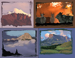 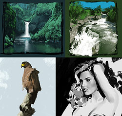
Roundtip
...and thus I apparently created yet another application with the express purpose of compensating for the main feature of the previous application which in turn attempted to sidestep that very feature from before. Uh. Honestly I didn't actually remember this one until I went through my old code folders today, but here it is and it does seem to produce some nice patterns. I'd have to investigate more closely if I wanted to really understand what it does.
Looks however like it does create bristly strokes and if its name is truthful it does it without brush strips. There's also some kind of diffusion blend brush.
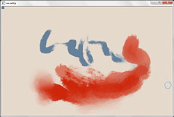 
Dartiste
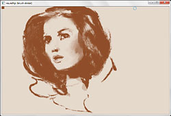
Another wildcard I had forgotten about. This one with a silly pretentious name.
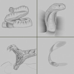
Main ambition was to recrate a kind of authentic pencil/charcoal look with noisy canvas structure. I don't think it turned out very nice in practice, but some of the test sketches look allright.
One weird feature was to set up a blunt gradient that you could quickly paint shaded areas with. It was based on the observation that you often find those things in drawings or simplifications of real photos if you will, and drawing them more quickly and easily should theoretically be a win. Maybe, if the results were more organic and dynamic.
It could definitely work better with a tilt-sensitive tablet pen, since you need to constantly re-adjust the angle if you only have position and pressure.
Blotchy
Now we've finally reached a current active project, as of early 2014.
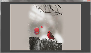
Another painter, this time with both round brushes and stripped ones. It is all based on a robust tiled rendering system which allows for convenient and efficient operations of various kinds, like lazy window updates and quick culling of coverage calculations.
Overall it's very quick and responsive, being very similar in technical design to old versions of Photoshop which have been running fine on all computers since the middle ages.
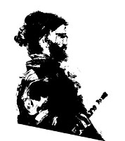
I'm using it to paint a lot of quick sketches these days, and I'll add various tools as I feel the need for them. Mainly I'm trying out different workflows to see what I prefer.
There's a really surprisingly enjoyable hard scratchy ink brush which I have ended up making a lot of free-flowing sketches with. For some reason I like how it brings out super-intense shadows and carved shapes that I can build from, but it's also somewhat hard to control if you try to refine anything.
So far I have no particular intention of adding "all those things" to make it something the average person would like to download, but it might happen some day. Definitely I want to enable selection and displacement/distortion to adjust proportions in a convenient way.
Pixelapp
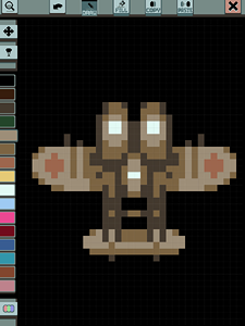
One more smoking fresh project. This one was made in CheeseHammer, and I actually created the bulk of it in just two days. Less than a week ago in fact.
I also packaged it up and sent it out to a few friends for testing on their iPads, and it seems to work fine! As soon as I've added some kind of persistent file storage I will see about uploading it for free on the App Store. There's a lack of good pixel editors there, I've found.
It's intentionally simple, with only the bare essentials. Pixel pen, flood fill bucket, copy/paste rectangular selection with some modifiers like flipping and rotating the copied area. Also a palette with customizable colors. This will hopefully turn into a set of preset and user palettes that can be saved for reuse.
You can pan around the image and switch to an overview mode. Two zoom levels exist although they're both pretty intense due to the nature of touch input. Some form of stylus is recommended but it'll work with a finger too.
Pixelade
This pixel editor is for a different purpose and was mainly used to try out my idea with the shader-based dynamic palette rendering. You paint on a canvas which internally is supersampled at 4x, and you can use soft/antialiased brushes to quickly make shaded effects without breaking the palettized look.
It also has built-in support for different types of mirror symmetry, which is useful in a lot of traditional pixel game graphics like shoot-em-ups.
I used this when drawing test graphics for the asteroid game concept.
A3Rigger
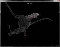
One aspect of a 3D animation system I was envisioning, intended for quick and painless animation of typical weight-painted skeleton-rigged meshes.
I tried rigging a model in Blender, but didn't find the process particularly entertaining so instead I did what I usually do and started making my own tool (conveniently leaving aside the actual content creation at that point).
The weight painting turned out allright, as did the bone creation and linking. What I ended up having difficulty with was the skeleton simulation in pose mode. I wanted it to behave like a ragdoll puppet so you could easily just grab it around to make different key poses and then eventually tween through those with manual adjustments. The problem I had seems really trivial but for some reason I haven't yet solved it. Basically the bones need to act like jointed springs maintaining all degrees of freedom around their connection point, but all my attempts ended up twisting or spinning in various entertaining but unproductive ways if there were more than a handful of bones. Seems there's a tendency to overcompensate when I add the constraints that seem natural to me. Needs a different approach. Might have to factor in bone "mass" derived from associated vertex weights, if I'm going to make a realistic puppet simulation. You can't have fingers acting with similar inertia as a torso.
Anyway, that left it dead in the water for the time being since I didn't want to proceed without solving that issue.
Intensitymap
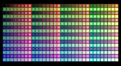
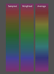
For my art projects I wanted a good algorithm for mapping luminance from RGB data. Instead of settling for weighted RGB sum (which is reasonable) or fancy Lab (which is confusing), I opted for an interesting experiment in which I manually adjusted 512 different intensity samples to match different color values by eye. Then I mapped all these through an interpolated formula to give smooth values for any point in the RGB space.
This points out an interesting overestimation of green intensity for the typical weighted approach. Probably you could bias this down selectively by adding a hue-controlled modifier to that model. It might be more practical than evaluating this sampled array each time you're doing something, but I did implement a color selector in Bristler using this code and it worked well.
As a side note, the notion of "intensity" from a saturated color stimulus is very vaguely defined and certainly a subjective impression. I kept having to redo the sampling process when I had shifted my idea of what "lightness" a deep blue color should really be, versus a red one.
proxyvis
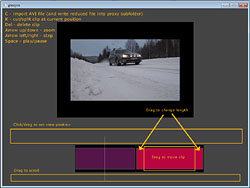
More long-time ambitions that finally got an outlet. I made a video editor that me and a friend could use for our film projects. Well, theoretically. Nobody has ended up using it a whole lot yet, and the interface lacks some flexibility and robustness to really make it practical.
The core motivator for this particular attempt was that my friend complained about all editor software he found being unable to deal with HD 720p material on his computer. I thought that sounded pretty stupid since you could just render your source clips into a lower resolution proxy and edit that, before applying the exact same frame timing to your original files when rendering the result out.
Turns out none of the applications seemed to do that. Possibly there's an option somewhere, and I've heard Apple's main editing suite does it, but to me it seemed like an obvious convenience factor.
After a fortunate discovery of some AVI processing example code online I was able to do what I needed, and really after being able to read/write video frames I just had to create an interface for navigating a timeline and cutting/pasting segments, so I did that too.
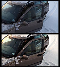
The really interesting bits started to happen when I plugged in my image enhancement code from the adaptive blur project above, and additionally some soft intensity levels to adjust and balance colors. That's another obvious thing that is lacking from most software - a levels adjustment that won't hard clip to white if you push it. I added a soft ceiling which had a very nice analog feeling that looked great in the image even if you got really aggressive. It's not strictly "levels" anymore, according to conventional terminology, but it's way more friendly to work with.
I added sound support too, and the ability to cut audio and video at different points between clips for better dialog arrangement, but somewhere between clumsy controls and a tendency to crash, it got paused in development.
I did however manage to wrap my video processing code into reasonably independent modules, so I've been able to reuse it for screen capture recording a few times, and I should be able to make a new video editor with much less pain and research.
Audio
Sinterference
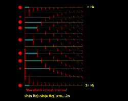
Musical harmony isn't all a magical subjective experience. I figured it probably has to do with reasonably simple fundamental properties of soundwaves, so I did a quick graph of added sine curves of sweeping frequency differential. I plotted the "match strength" of a waveform repeated onto itself with a given offset, so a perfectly repeating pattern would be all low values until it hit the exact repetition interval/frequency and then it would spike.
Turns out there's indeed a very clear pattern which corresponds largely with the layout of western musical notes in an octave. The choice of 12 steps spaced according to an exponential frequency curve is probably a bit of a simplified compromise though, to make things more easily organized and generalized.
Most traditional note pairs end up with a pretty close match to nice "simple" harmonics, but some of them fall far between. This is probably useful to create more dynamic emotions in music though, since you can choose to include some levels of dissonance that might not be available if the note spectrum was chosen to only hit the sweet spots.
In any case this is surely conventional wisdom for more experienced musical types, but it was a fun and enlightening hands-on experiment to me.
Some day I want to try composing some music using hand-picked frequencies that all line up perfectly with the primary harmonics, just to hear what it'd sound like.
Improv
Partly inspired by the above results, but this time manually encoded as "desirable" note pairs, I set about writing some logical rules for selecting appropriate harmonies when you build sets of concurrently playing notes.
This ended up being a system that could improvise a continuous flow of "music", and never play a dissonant chord despite not having actual chords or scales programmed in.
It's pretty entertaining listening to it, although the additional rules governing structure and rhythm are extremely basic, so mostly the results are pretty random. It basically tries to roughly maintain continuous flows of notes that don't jump up or down too wildly, and the harmony rules only kick in when notes overlap. So it won't have any idea of what should follow in a disjointed sequence.
I want to develop this further sometime to make a more controlled automatic composer that could maintain themes over longer stretches and also introduce recurring "hooks" or other elements that define human music. Also I have a gut feeling that I should be able to codify the rules of basic rhythm pretty well, although it's not been tested yet.
Download a short audio sample
Paramole
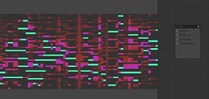
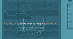
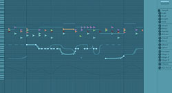
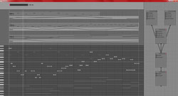
This is essentially my take on a sequel to musagi, with the main initial focus being on parameter curves which were sorely lacking from that application. Additionally view zoom is a core feature to prevent you from squinting at few-pixel wide note grids.
I also want the interface to be really minimal and grow naturally from the content of your song rather than sprawling everywhere when the application is launched. You're meant to always edit "the whole song" in its global timeline with everything not immediately relevant being visible as faint ghost shadows in the background for reference and context.
So far I've made one initial test version that established a way of editing curves, but it got unwieldy when I started to go deeper into note editing and samples. It also had a single hardcoded test synth which wasn't very practical.
The second iteration has a more comfortable layout with dynamically resizable work areas, and it supports VSTi plugins or internal synth modules. Poppeman has been helping me out a bit with the buggy VSTi code moved over from musagi.
Unfortunately this version hasn't yet been wired properly to get the parameter curves or sample support, so right now there are two very different steps in the development flora. It should be pretty straight-forward to copy the relevant curve code from the first version though, and tune it a bit to fit with the different interface.
Also, there's absolutely no sensible graphics for this yet. I want to play around with a lot of concept mockups until I can really find something that looks allright. So far it's been tricky, since I want it to be simple and clear but still attractive.
Back to all projects
|
|
|
|
|
|
|
 |
|
|
|

